
Volto Light Theme 8.0.0 is here
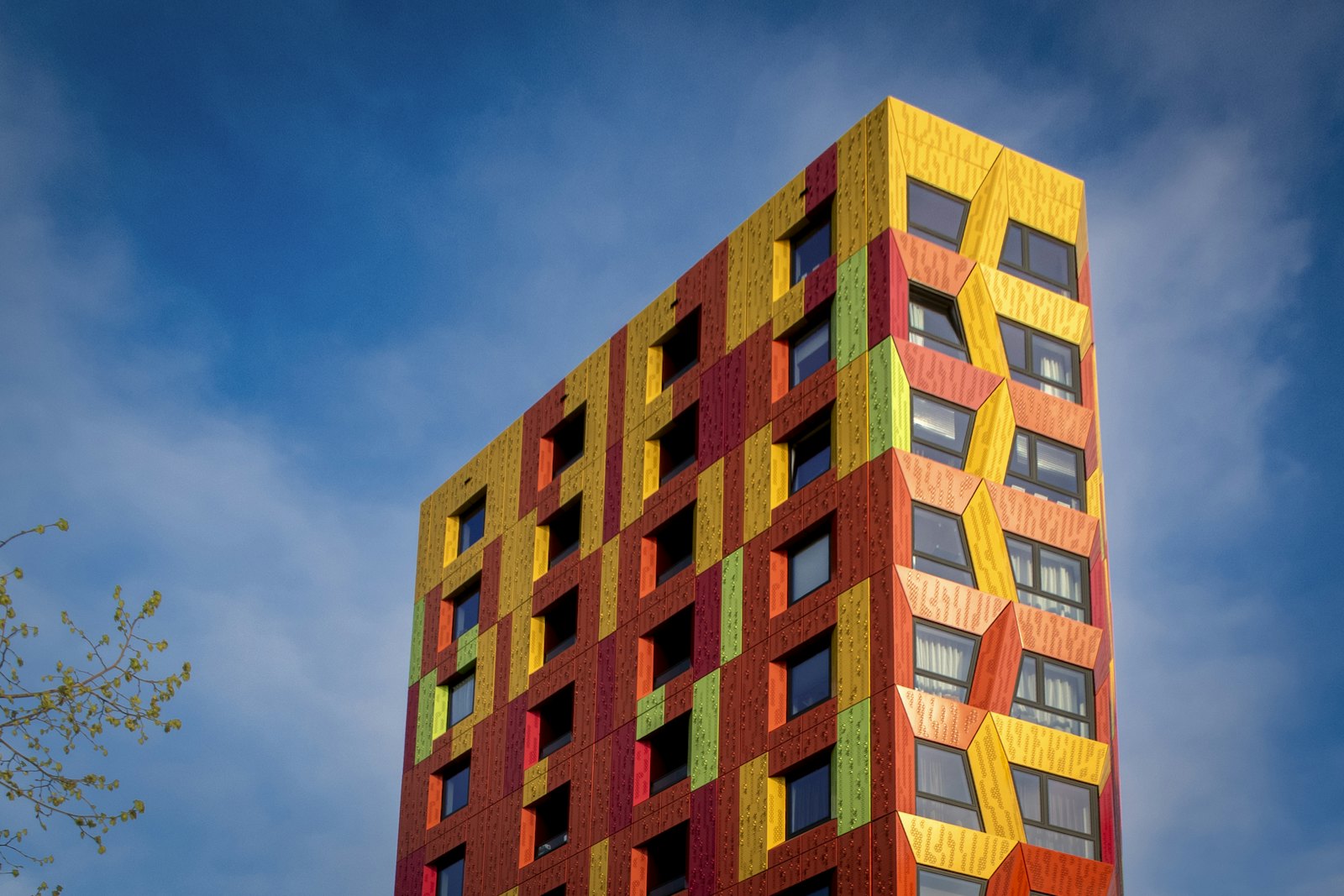
Today we're releasing Volto Light Theme 8.0.0 final, the biggest step forward for VLT since its inception. After a long and deliberate alpha series — thirty-plus releases of refactoring, hardening, and polishing — VLT 8 lands on a modern foundation, with an architecture that treats every part of the theme as something you can swap, extend, and test.
If you've only ever used VLT as "the default Plone 6 look and feel," version 8 is a good moment to look again. Under the hood it has become a genuinely composable theming layer.
Built on Volto 19, Plone 6.2 and @plone/components 4
VLT 8 sits on the latest Plone frontend stack: Volto 19, Plone 6.2, and @plone/components 4.0. That upgrade brought the modern React Aria-based component catalog into the core of the theme, which in turn let us rethink a lot of the styling from first principles.
This is a hard requirement, and the single most important thing to know before upgrading: projects need to move to at least this Volto version, and the react-aria-components catalog is now enforced from Volto. As always, the upgrade guide walks you through the migration step by step.
A leaner core: add-ons are add-ons again
The headline architectural change in VLT 8 is that the theme no longer bundles its recommended add-ons as peerDependencies. Blocks like the slider, button, separator, carousel, logos, highlight and calendar blocks now live cleanly in their own packages, and all of the theme-specific customizations that used to be tangled inside VLT have been moved back into the blocks where they belong.
The practical effect: a smaller, more focused VLT, and add-ons you can adopt — or leave out — deliberately. Projects choose what they install, and each block ships and versions on its own cadence. Slider flag styling, button styling, separator behavior: all of it now travels with the block, not the theme.
Swap structural components through the registry — no more shadowing
If you've ever had to shadow the header, footer or navigation just to change one thing, this one's for you. VLT 8 lets projects select their structural components through the registry instead of component shadowing.
Header, navigation, mobile navigation, footer, breadcrumbs, language selector, logo, search widget and tags can each be swapped by pointing config.settings.vlt.components at your own implementation. It's a cleaner, more predictable extension model — and there's a dedicated how-to guide that shows exactly how to do it. Big thanks to Erico Andrei for driving this.
A real design system, documented and visual
Theming is only as good as its documentation, so VLT 8 ships a proper Design System reference — tokens, composition rules, and a full block catalog — published in the Sphinx docs. Alongside it we added a machine-extracted visual block catalog generated straight from Storybook (via make design-catalog), so the documentation of what every block looks like stays honest and in sync with the code.
To back that up, every VLT block now has Storybook stories with variants and mock data, and the story BlockWrapper reproduces the real content-area structure so themed bands and block widths render faithfully in isolation. We also added a conceptual Color system guide and expanded the colors reference.
Testing you can trust
Quality got a serious investment this cycle:
A new Playwright-based acceptance test setup (under frontend/acceptance), complete with a backend reset fixture, login/content/accessibility utilities, a starter suite, Makefile targets and a CI workflow.
Visual regression testing for Storybook stories, with the snapshots moved into a dedicated repository (kitconcept/vlt-visual-regression) to keep the main repo lean.
CI now enforces the mandatory OVERRIDE header on shadowed components, so customizations stay traceable.
Better blocks, better editing
VLT 8 is full of block and editing improvements that add up to a nicer experience for editors and integrators alike:
Recoverable block error boundaries, so a single misbehaving block no longer takes down the page.
Opt-in block model v3 support across views.
Unified CSS and alignment/width handling for floating image, map and video blocks.
The Image block now resolves sizes through a size:noprefix style field and a --media-size CSS variable, and the Image component receives proper image sizes.
New Form Block styles, an Event Calendar block, and refreshed styles for the search results page.
A redesigned Card component using a modern CSS stretched-link pattern (note: this is a breaking change for custom Summary components — see the upgrade guide).
Improved layout for full-width blocks in Edit mode.
Mobile and accessibility
A lot of careful work went into the small screen and into a11y:
A mobile sticky menu (toggleable via a backend field), plus tools and the language selector moved into the mobile navigation.
Numerous mobile layout fixes for the header, social icons, navigation and language selector.
Accessibility improvements throughout, from unique headings in example content to image caption markup and ARIA labels on block pagination.
Internationalization
VLT 8 broadened its language coverage significantly, including integration with the Polyglot project and updated German, Spanish, Basque and Brazilian Portuguese translations.
Upgrading
VLT 8 is a major release with breaking changes — the Volto 19 / @plone/components 4 baseline, the un-bundling of recommended add-ons, the Card/Summary component changes, and the footer field renames in the kitconcept.footer behavior all need attention. Please read the upgrade guide before you start, and take the un-bundled add-ons as an opportunity to install only what your project actually uses.
Thank you
VLT 8 is the product of many hands over many months. Our thanks to everyone who contributed code, reviews, translations, documentation and bug reports across the alpha series — the kitconcept team and the wider Plone community alike. This release is a community effort in the best sense.
Ready to try it? Head to the Volto Light Theme documentation to get started, and let us know what you build.